5 B2B Landing Page Layouts That Generate More Leads
Top b2b landing page layouts for higher conversions. Proven B2B landing page design patterns and a lead generation website template guide.


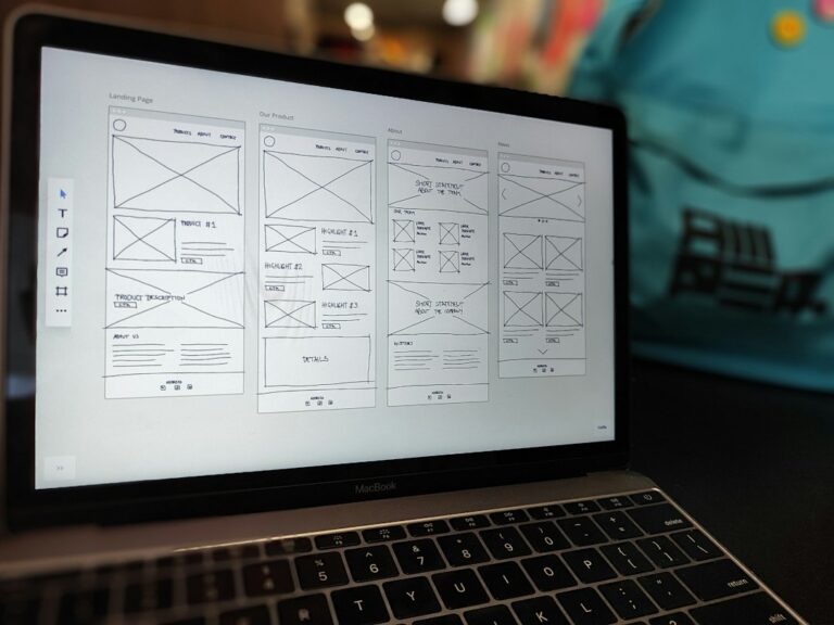
B2B landing page layouts are the bit that quietly decides whether your campaign works. Not the colour palette. Not the clever line in the hero. The layout, meaning the order of information and the path to the next step, is what helps a buyer make sense of your offer and follow through without getting irritated.
In B2B, that next step is usually not a checkout. It is a demo request, a consultation booking, or a content download that kicks off a longer sales cycle with more than one person involved. Your page has to keep attention tight and build confidence quickly, without feeling like you are trying too hard.
Below are five B2B landing page layouts we see convert again and again, plus the basics they all share. Use them as a practical pattern library you can build in WordPress, whether the traffic comes from paid campaigns, an email push, or outbound.
What makes B2B landing page layouts different from “normal” pages
A landing page is a purpose-built page tied to one campaign and one action. That is why the highest-converting pages usually remove distractions like top navigation and extra links. The goal is not to explain your entire company. It is to match one buyer intent to one next step.
That “one page, one offer, one CTA” principle shows up repeatedly in third-party guidance like GetResponse’s B2B landing page guide. We see the same thing in real builds. When you give people ten options, most will take the easiest one, which is leaving.
When Revo plans landing pages, we map each one back to the buyer journey stages, Awareness, Consideration, or Decision. It keeps the page honest. If you are trying to do all three stages at once, the layout ends up messy. This is baked into our B2B Websites service, because structure comes before design in our method: strategy first, structure second, design third.
Layout 1: Hero plus form (short capture) as a B2B landing page layout
This is the fastest route to a lead. The offer and the form sit above the fold, the page is stripped back, and the path to “yes” is obvious. It is a good fit when the commitment is small, like a checklist, a short guide, or a newsletter sign-up.
Keep the headline benefit-led and plain spoken. Under it, add a short line that answers “who is this for?” Then keep the form tight, usually name and email. Add one small trust cue just under the form, such as a relevant logo strip or a single specific testimonial.
- Best for: lead magnets, newsletter sign-ups, content gating
- Works because: low effort to understand, low effort to act
- Watch-outs: if the offer is high-stakes, a short page can feel thin
Layout 2: Long-form persuasion for demo requests (a B2B landing page layout for higher commitment)
If you are asking for a meeting, most buyers need more than a headline and a form. They want context. They want proof. They want to know what happens after they click. This is where a longer page earns its keep, as long as it stays focused on one CTA.
A solid sequence often looks like this:
- Hero: clear promise plus one sentence of who it is for
- What you get: a short, scannable overview of the outcome
- How it works: 3 to 6 capability blocks with simple visuals
- Proof: a case study highlight, testimonials, or recognisable clients
- FAQ: handle the obvious objections before the form
- CTA repeats: same ask, same wording, placed sensibly as you scroll
If you can show the product or service in action, do it. Interface previews, short walkthrough clips, or even annotated screenshots reduce uncertainty because they make the offer tangible. That is a recurring recommendation in Heyflow’s B2B landing page best practices.
- Best for: demo requests, consultations, complex B2B services, higher-ACV offers
- Works because: it answers “Is this for me?” and “Can I trust you?” before the ask
- Watch-outs: longer does not mean broader. Every section supports the same CTA.
Layout 3: Lead magnet preview first (show the asset early)
If your offer is content, lead with the content. Show the report cover. Show a sample page. Show a preview of the template. Buyers decide fast whether the asset looks like it has substance.
Then make it easy to scan what is inside:
- What the reader will learn
- Who it is designed for
- How long it takes to read or watch
- What they can do with it straight away
This layout is also easy to build and test. You can keep the first form short, then use the thank you page or follow-up email to offer the next step, like a call to apply what they have learned. If you want a few real-world examples of how B2B brands structure these pages, Unbounce’s B2B landing page examples is a useful reference point.
- Best for: whitepapers, industry reports, webinar registrations, email courses
- Works because: the value is visible, not vague
- Watch-outs: do not over-ask for data unless the asset is genuinely premium
Layout 4: Social proof-led B2B landing page layout (credibility first)
If you already have strong client names, strong testimonials, or strong case study stats you can stand behind, bring them forward. This layout flips the order. You lead with trust, then you make the ask.
What this can look like in practice:
- A credibility-heavy headline with a logo strip right underneath
- A named testimonial, with role and company, placed in the hero area
- A single specific proof point, like “replatformed without losing rankings” if it is true and verifiable
Specificity matters. Anonymous quotes read like filler, especially for buyers in a committee who need to justify a vendor choice internally.
- Best for: established consultancies, agencies, high-trust services, crowded categories
- Works because: it reduces perceived risk before the form appears
- Watch-outs: a logo wall without relevance can feel like noise. Curate it.
Layout 5: Multi-step interactive qualifier (better fit, not just more leads)
Sometimes your problem is not volume. It is quality. If you sell a complex service, you might need to screen for budget range, timeline, or problem type. A long static form can do the opposite of what you want, especially on mobile.
A multi-step flow makes the first click easy, then gathers detail in 2 to 4 quick steps, usually saving contact details for the end. It feels more like a conversation than paperwork. Conditional logic also lets you keep the questions relevant, which tends to improve completion.
This approach is becoming common in B2B lead generation, and the Perspective lead generation landing page breakdown explains why step-by-step collection can lift form completion while protecting data quality.
- Best for: agencies, professional services, niche B2B offers, anything where fit matters
- Works because: it reduces form intimidation and keeps momentum
- Watch-outs: do not turn it into a quiz. Each step must feel quick.
What the best B2B landing page layouts all have in common
Different layouts suit different offers. The fundamentals do not change. If your page is underperforming, it is usually one of these, not a missing animation.
- No escape routes: remove navigation and unnecessary footer links.
- One primary CTA: repeat it, but do not compete with it.
- Benefit-led messaging: lead with what the buyer gets, not a list of features.
- Mobile-first: assume the first visit is on a phone, even for high-value deals.
- Specific proof: named testimonials, relevant logos, verifiable claims.
- Message match: your ad or email promise matches your landing page headline and offer.
If you are tightening the conversion path across your site, landing pages rarely fail in isolation. They usually fail because the offer, proof, and next steps are not aligned. We cover the wider context in this blog post on boosting B2B lead generation websites, which is a good companion read if your lead flow feels inconsistent.
How to choose between B2B landing page layouts (quick decision table)
Choose the layout based on the commitment level of your offer and the buyer stage you are targeting. Short pages tend to win when the ask is small. Longer pages tend to win when the decision risk is high.
| Offer type | Buyer stage | Best layout | Primary success metric |
|---|---|---|---|
| Checklist, newsletter, lightweight guide | Awareness | Hero plus form (short capture) | Form completion rate |
| Whitepaper, report, webinar | Awareness to Consideration | Lead magnet preview first | Cost per lead and lead-to-MQL rate |
| Demo, consultation | Consideration to Decision | Long-form persuasion | Booked meetings per visitor |
| High-trust service with strong client list | Consideration | Social proof-led | CTA click-through rate |
| Complex service that needs fit checks | Decision | Multi-step qualifier | Qualified enquiry rate |
How Revo builds these layouts in WordPress without making it a science project
You do not need a heavy tech stack to publish strong landing pages. You need the right blocks, assembled in the right order, with fast load times and clean tracking.
Revo builds strategy-led, conversion-focused WordPress sites using a lightweight approach with Advanced Custom Fields (ACF), Tailwind CSS, and Gravity Forms. That setup keeps pages quick to ship and easy to improve as campaigns evolve.
If you want a fixed-scope way to get the core conversion pages live with a defined launch date, Website in a Week is designed for it. It is not a template. It uses a module library, so you can spin up new landing pages without rebuilding everything from scratch each time your offer changes.
FAQ: B2B landing page layouts for lead generation
Should a B2B landing page remove the navigation?
Yes, in most campaign scenarios. Navigation gives visitors an easy exit before they take the action you built the page for. If you need legal links, keep them minimal in the footer and avoid competing CTAs.
How many fields should your form have?
As few as you can get away with for the offer. For content downloads, start with name and email. For demo requests, add fields that help qualification, but consider a multi-step flow to reduce drop-off.
Is a short landing page design always better?
No. Short pages work when the commitment is small. If you are asking for a meeting or selling a higher-ACV service, more proof, FAQs, and specificity often improves conversion because it reduces risk.
What is the best lead generation website template for B2B?
The best “template” is the layout that matches the offer and buyer stage. For top-of-funnel, start with a hero plus form or a lead magnet preview first page. For bottom-of-funnel, use long-form persuasion or a multi-step qualifier to protect lead quality.
How do you know if the layout is the problem or the offer is the problem?
If you have traffic but very low CTA clicks, your messaging and above-the-fold layout are usually the issue. If you have CTA clicks but low form completion, the form and friction are usually the issue. If you have form completions but low sales acceptance, your qualification and proof are usually the issue.
Conclusion
The right layout makes your offer easier to understand, easier to trust, and easier to act on. Pick the B2B landing page layout that matches the commitment level of your CTA, then execute it with discipline: one primary CTA, specific proof, and fewer distractions.
If you want a second set of eyes on your landing page, start with booking a call with Revo. You will leave with clear, practical fixes you can ship.